July 20, 2018 at 7:12 am
#1880
Keymaster
Hi @aeromarine,
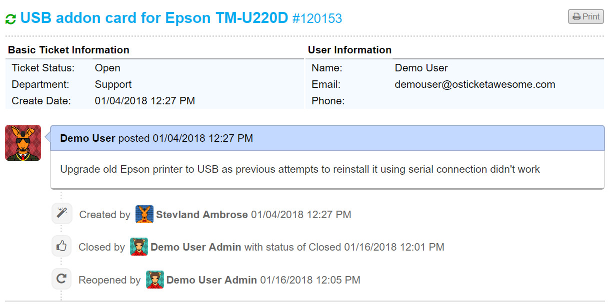
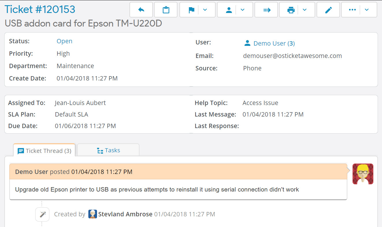
I disagree. There are always a few things I would improve, but I think the Client Ticket View page looks fine. It is highly stylized using CSS. Compare to osTicket core:

The main difference between the Ticket View page in Client vs Staff is that the info on the Staff side is inside white containers.

Is that what looks better to you? It is something I could consider.