Hi @purpletree,
Reply Waiting Indicator
It was felt early on that the bold text to denote a ticket with a reply waiting in osTicket was too visually jarring.
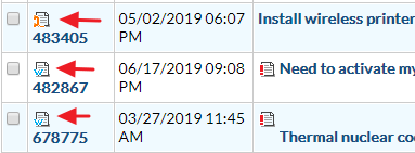
In osTicket Awesome, tickets with a waiting reply have a green indicator to the left of the ticket number:

Now that you know what to look for, and once you’ve gotten used to it, you will hopefully find it adequate.
Having said that, if you want to revert back to having the bold text, you can add the following code to /osta/user-styles.css:
td.osta_subject.new-reply-waiting a {
font-weight: bold !important;
}
Ticket Source Icon
I’m not sure what you need by “w” and “@” indicators. It sounds like you are referring to the ticket source icons, so I will proceed to reply with that assumption. Let me know if I’ve misunderstood.

The ticket list packs a ton of information in a very condensed amount of space. Early on in the development of osTicket Awesome the ticket source icons were deemed to be unnecessary. This is the first time that anyone has even remarked on the fact that they are missing. I unfortunately have to tell you that it is very unlikely that this function will ever be added back to the ticket list.
You probably realize this already, but you can still find the ticket source information within the ticket view page:

I hope this is adequate for your needs. I’ll mark this as resolved for now, but feel free to reply.