-
-
July 20, 2018 at 5:28 am #1873AaeromarineParticipant
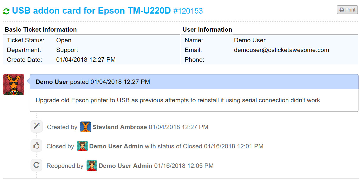
Ticket info table from client side is pretty ugly not being “stylized” by CSS
In the meantime, in order to improve the appearance we’ve applied…
class="ticket_info"…to the table at include\client\view.inc.php (line 30)
- This topic was modified 7 years, 7 months ago by aeromarine.
- This topic was modified 7 years, 7 months ago by aeromarine.
- This topic was modified 7 years, 7 months ago by aeromarine.
-
-
-
July 20, 2018 at 7:12 am #1880
stevland
KeymasterHi @aeromarine,
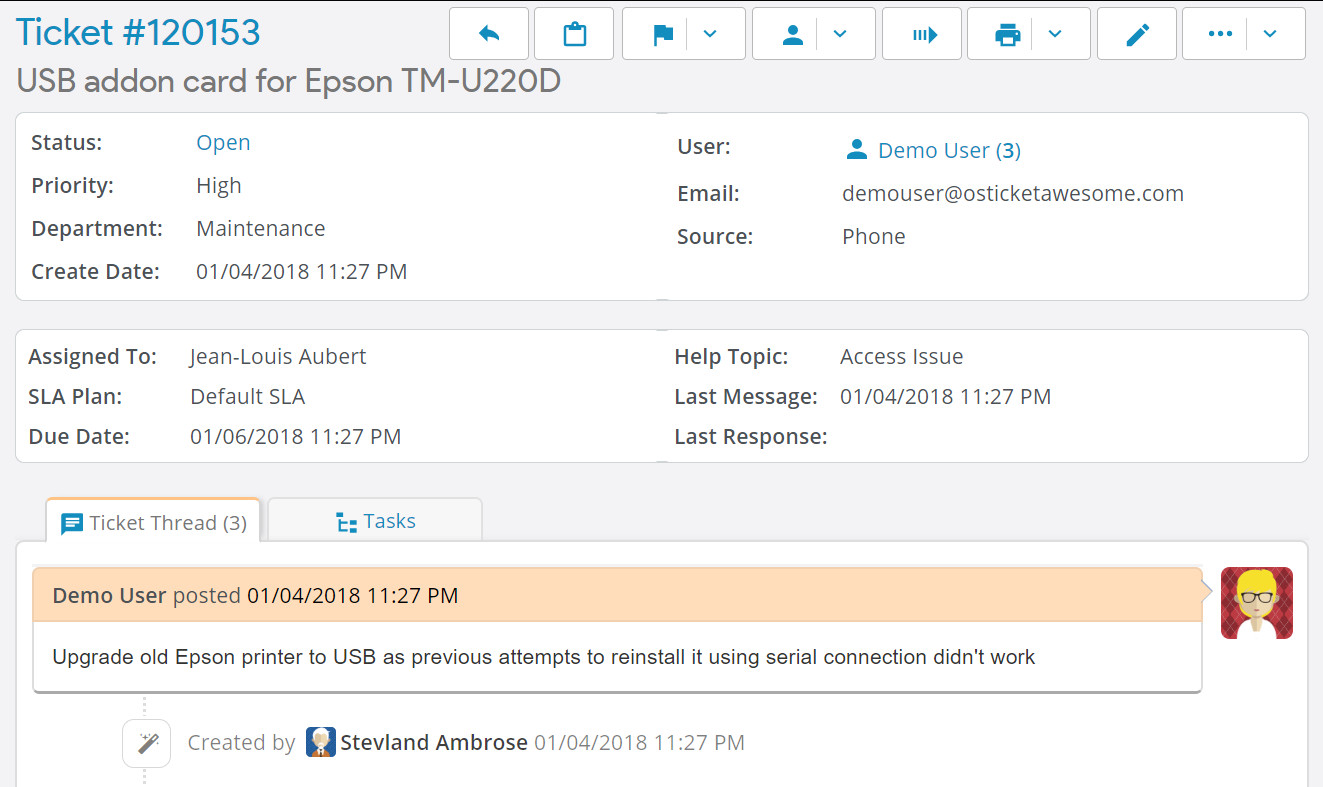
I disagree. There are always a few things I would improve, but I think the Client Ticket View page looks fine. It is highly stylized using CSS. Compare to osTicket core:

The main difference between the Ticket View page in Client vs Staff is that the info on the Staff side is inside white containers.

Is that what looks better to you? It is something I could consider.
-
July 23, 2018 at 1:50 am #1947AaeromarineParticipant
Yep. I know that the client side is styled using CSS….except that table. It’s a shame that everything else has the same look and feel but not the main info table.
Just a tiny modification by adding the white container with rounded corners bold titles improves its appearance and does not give the sensation of seeing an HTML fragment of the 90s. IMO.
Please consider also to add a non breaking space between button icons and its title.
Keep up the good work! 🙂
-
October 31, 2018 at 3:27 pm #2494
stevland
KeymasterThank you for your persistent suggestions, @aeromarine.
I have implemented the changes as you’ve requested, which you can review here.
These changes will be included in the next update.
-
November 5, 2018 at 12:26 am #2533AaeromarineParticipant
-
You must be logged in to reply to this topic.