-
-
May 21, 2021 at 4:01 pm #7678
stevland
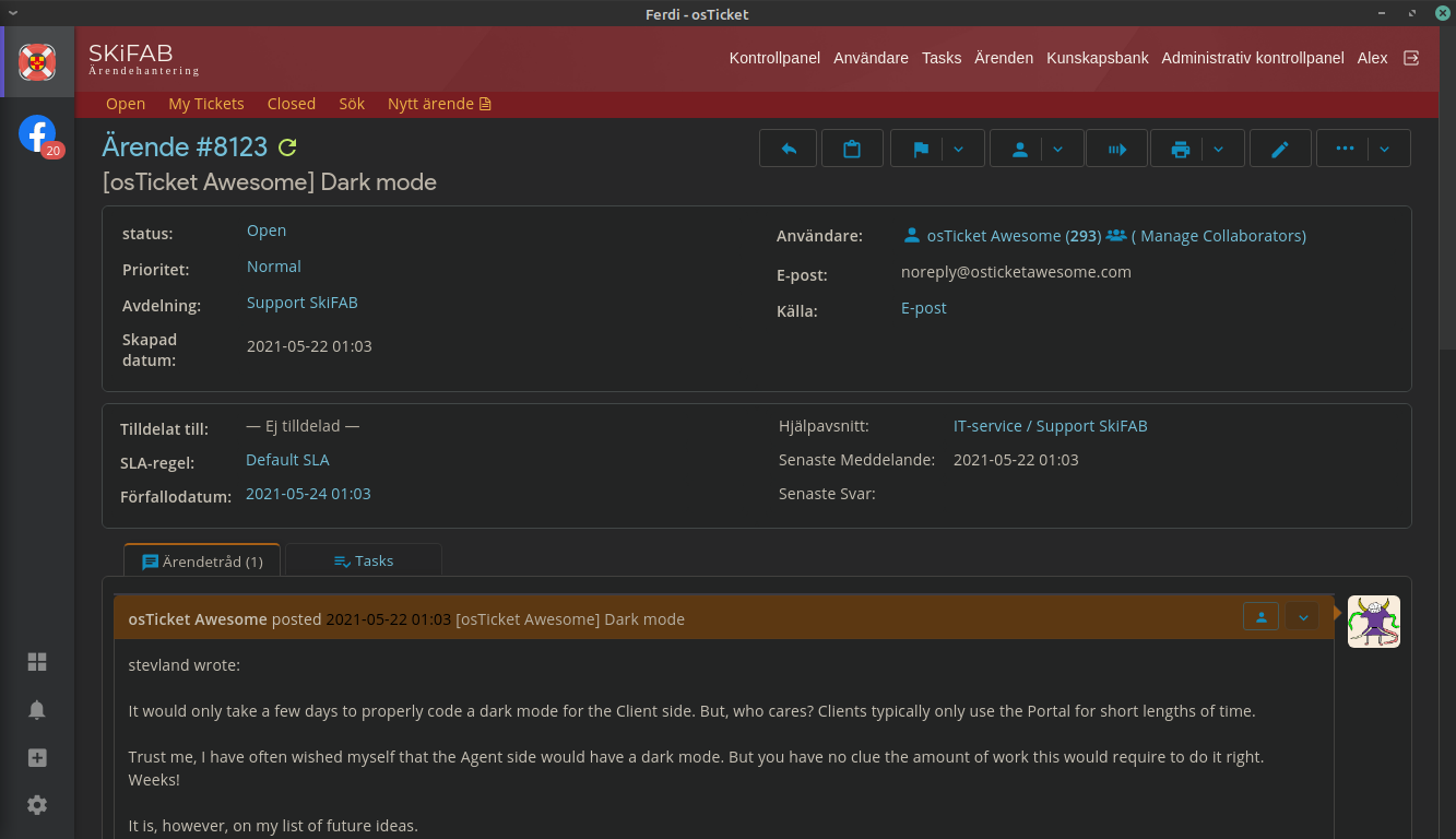
KeymasterIt would only take a few days to properly code a dark mode for the Client side. But, who cares? Clients typically only use the Portal for short lengths of time.
Trust me, I have often wished myself that the Agent side would have a dark mode. But you have no clue the amount of work this would require to do it right. Weeks!
It is, however, on my list of future ideas.
And I just tossed it onto the Feature Request page if you want to vote it up!
-
October 20, 2022 at 8:26 am #12425SStephen@EhOSParticipant
Bump
-
November 21, 2022 at 10:39 am #13601
epitzul
Participantmine does this when i force dark mode in Edge

Don’t know how to take the highlighting out.
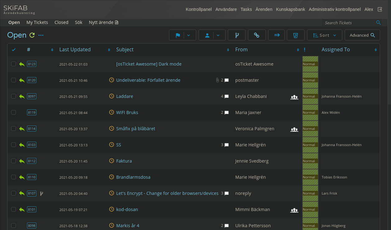
Dark mode is a must for us now, i have monitoring TVs and i wish to preserve them so dark mode makes a lot of sense and the white background is very hard to read from a distance. It’s usable like this, removing that highlighting would be best case scenario though
-
-
You must be logged in to reply to this topic.

