[Resolved] Mobile version display bug: reply and internal note expand badly

    • May 27, 2019 at 9:02 am #4249
      I
      IT Support
      Participant

      Hi, from the staff demo here I took the following screenshot:
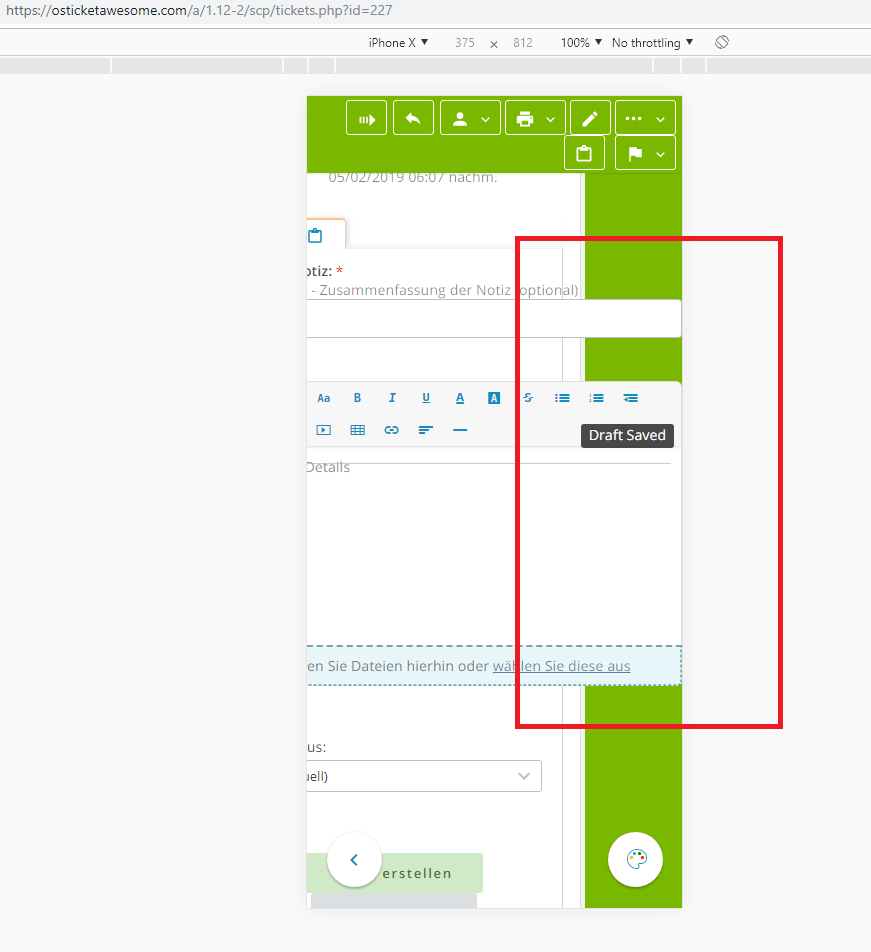
      As you can cleary see, the text fields for adding an internal note or a reply are sized bad. Maybe it’s worth to add it here: that small “Draft saved” is always there in mobile version. Don’t know if it’s causing the issue. 

    • May 27, 2019 at 4:30 pm #4260
      stevland
      Keymaster

      Thank you. Fixed in osTicket-1.12-Awesome-103.

    • May 28, 2019 at 9:43 am #4278
      I
      IT Support
      Participant

      Hi, yes it’s fixed for replies now, thanks for doing it so fast! But it’s still not fixed for notes. I added an !important to line 747 in staff-mobile.css which seems to fix it… 

    • June 2, 2019 at 1:11 pm #4384
      stevland
      Keymaster

      Nice one! Thank you for the fix.

You must be logged in to reply to this topic.

Topic Tags