Hello,
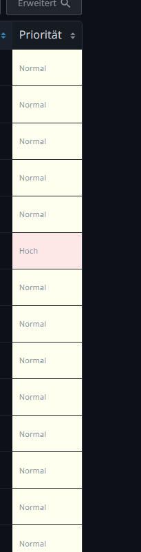
In my current setup, the priority column shows text values like “Normal” or “High”. However, in the demo, priorities are displayed as color blocks without any text — which looks cleaner and is easier to scan visually.
Could you check if this visual style can be applied to my instance as well?
Thanks!