-
-
August 1, 2019 at 9:22 pm #4853DpurpletreeParticipant
In the theme, I see some things missing in ticket list view like
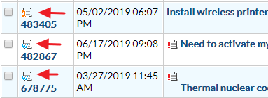
- When a ticket is replied by customer and agent has not replied, it shows in bold text in default theme. When replied, font becomes normal. This way, an agent know which ticket is replied, and which he still has to reply. But in this theme, there is no way to understand which ticket was replied and which was not.
- In default theme, there are some other indicators like “w” and “@” indicators for every ticket in list view, to indicate which ticket was opened from web and which from email. However, those indicators are also missing in this theme.
So it is difficult for me to use this theme. Can you let me know how I can solve this issue?
-
-
-
August 1, 2019 at 10:17 pm #4854
stevland
KeymasterHi @purpletree,
Reply Waiting Indicator
It was felt early on that the bold text to denote a ticket with a reply waiting in osTicket was too visually jarring.
In osTicket Awesome, tickets with a waiting reply have a green indicator to the left of the ticket number:

Now that you know what to look for, and once you’ve gotten used to it, you will hopefully find it adequate.
Having said that, if you want to revert back to having the bold text, you can add the following code to /osta/user-styles.css:
td.osta_subject.new-reply-waiting a {
font-weight: bold !important;
}Ticket Source Icon
I’m not sure what you need by “w” and “@” indicators. It sounds like you are referring to the ticket source icons, so I will proceed to reply with that assumption. Let me know if I’ve misunderstood.

The ticket list packs a ton of information in a very condensed amount of space. Early on in the development of osTicket Awesome the ticket source icons were deemed to be unnecessary. This is the first time that anyone has even remarked on the fact that they are missing. I unfortunately have to tell you that it is very unlikely that this function will ever be added back to the ticket list.
You probably realize this already, but you can still find the ticket source information within the ticket view page:

I hope this is adequate for your needs. I’ll mark this as resolved for now, but feel free to reply. -
August 2, 2019 at 12:36 am #4860DpurpletreeParticipant
For the first issue, I do not see any green circle. I am on 1.10.7.
-
August 2, 2019 at 9:03 am #4862
stevland
KeymasterHi @purpletree,
Are you sure you don’t mean 1.10.6? I haven’t released anything for 1.10.7 yet.
Unfortunately, the code I provided above won’t work on 1.10.6 and I can’t seem to come up with an elegant solution for you.
I highly recommend that you upgrade to 1.12.x!
osTicket 1.12 core has a lot of great new features and on osTicket Awesome’s side that is where all of the new development is happening.
I am, however, working on a 1.10.7 release (although I’m not even sure anyone is interested in it). I will see if I can add the bold text function back into the mix.
Please let me know if you decide to upgrade to 1.12.x so I don’t spend extra time on 1.10.7 needlessly. Cheers.
-
August 2, 2019 at 9:24 am #4863
stevland
KeymasterWait… I was over thinking it.
One can simply add something like this to /osta/user-styles.css in osTicket Awesome for 1.10.6:
a.Icon.Ticket.preview b,
a.Icon.emailTicket.preview b,
a.Icon.phoneTicket.preview b,
a.Icon.webTicket.preview b,
a.Icon.otherTicket.preview b {
font-weight: 700;
font-size: 10px;
font-family: 'Open Sans', sans-serif;
color: #004d73;
}This will alter the Ticket Number text, which is how “Reply Waiting” is indicated in osTicket 1.10.x. You can change the font size, color, etc. as desired.
This will also work in osTicket Awesome for 1.10.7 when it is released.
-
August 5, 2019 at 2:10 am #4876DpurpletreeParticipant
Actually I am on 1.10.4. Sorry for the confusion. The CSS you sent made no difference in the ticket view.
-
August 6, 2019 at 9:11 am #4881
stevland
KeymasterI’ve confirmed that the above code does work in 1.10.4. You may need to clear your browser cache to see the change. It is also possible that the change is too subtle and you are not noticing the difference. To make it more obvious you can try something like this:
a.Icon.Ticket.preview b, a.Icon.emailTicket.preview b, a.Icon.phoneTicket.preview b, a.Icon.webTicket.preview b, a.Icon.otherTicket.preview b {
font-weight: 700;
font-size: 10px;
font-family: 'Open Sans', sans-serif;
color: #ffffff;
background: #30a400;
}
But what I really recommend is to upgrade to 1.12.x.
-
August 7, 2019 at 8:14 am #4889DpurpletreeParticipant
Ok so I upgraded it to 1.12.2..
default store worked fine.
But as soon as I uload your theme files, I get 403 error for user interface, and 404 for admin interface (/scp/).
Can you check please?
-
August 7, 2019 at 8:30 am #4890DpurpletreeParticipant
Please ignore the last reply. It was a local issue.
-
You must be logged in to reply to this topic.