-
-
May 30, 2019 at 4:55 am #4312MmfostonParticipant
Loving the changes this makes, and have been well received in the office, just two areas we wondered if there is a way to change.
The choice of colours is not mine, as you can see from this graphic, the “settings” in bold is pretty clear, but the other entries aren’t so clear. Is it possible to easily change this? Maybe to have them all use the bold font and highlight with a different colour.
The second is in the footer…
can the logo’s be changed to appear in white (or be removed which was their preference but I’d be happy to keep them if white)
Again the colours aren’t my choice they are the company approved choices, so am trying to work with them.
Cheers
Mike
-
-
-
May 30, 2019 at 5:20 am #4313MmfostonParticipant
So, to answer my own question to some extent, I found the colour of the graphics at the bottom is dictated by the menu text at the top right.
Having changed this to black, the logos have improved but the menu still looks slightly faded.
I should add this is being run on remote desktop with a thin client, so I need to experiment to see if that’s causing this, but for example so is the font in this forum and this is very clear. But progress at least.
-
June 2, 2019 at 12:57 pm #4381
stevland
KeymasterYou can add your own custom CSS to /osta/user-styles.css. It is the last style sheet to be loaded by osTicket Awesome, so anything you add to this file will override any previous styles.
It these examples I’m using black (#000000). Obviously you should change this as desired.
To change the color of the top right navigation and use a bold font:
#header #nav a {
color: #000000 !important;
font-weight: bold !important;
}(Note that a bold font takes up more space and, depending on what language you are using, may mess up the layout on smaller screens before the mobile layout kicks in.)
You can change the color of the logos in the footer with this:
#footer svg {
fill: #000000 !important;
}Or remove them all together.
#footer svg {
display: none !important;
} -
May 1, 2020 at 4:27 pm #5665
Simon
ParticipantHi,
Engineer
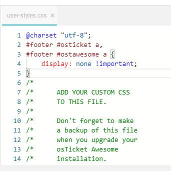
I tried the method introduced on the homepage of the official website-help page,
but I still can’t remove the osTicket and osTicket Awesome logos, what went wrong?
osTicket v1.12.4 // osTicket-1.12.4-Awesome-101<br />
PHP 7.3.16 // MySQL 5.7.25 // Apache web server
-
May 1, 2020 at 7:06 pm #5666
stevland
KeymasterHI @Simon,
That looks good. You may need to clear your browser cache to see the changes.
-
-
You must be logged in to reply to this topic.