-
-
September 24, 2019 at 2:13 pm #5136JjfleducParticipant
Edit ;
I found your old answer via google : https://osticketawesome.com/forums/topic/text-size-in-menus-and-languages-issues/
Hi,
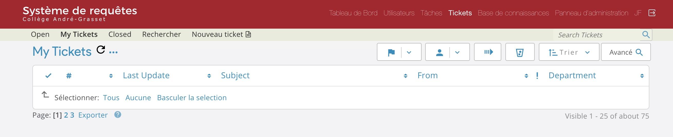
The font size and font weight used in the top menu bar of the agent and admin panel is not readable (see screenshot). Where can I change it in CSS? Thanks!
-
September 24, 2019 at 3:14 pm #5138
stevland
KeymasterI’m glad you found the answer, and I hope you’ve gotten this sorted. But something is weird about the way the navigation bar is showing in your screenshot. It shouldn’t look like that. Before changing the CSS, please try clearing your browser cache to see if that helps.
-
October 1, 2019 at 8:21 am #5189JjfleducParticipant


Hi, in case this can help your troubleshooting for future release, this is what the same exact install looks like before I start customizing it. Top screenshot is Safari MacOS, the bottom one is Chrome MacOS. I find it surprisingly strange that CSS code can appear so screwed up in Chrome, especially the color of the nav links!
BTW is there a way I can underline JUST the active menu? Otherwise when it’s ticker you don’t see which one is active…
-
You must be logged in to reply to this topic.