-
-
July 13, 2020 at 10:01 pm #6071NNIcholasjansenParticipant
Hi there,
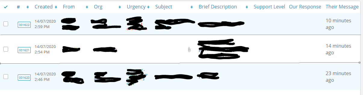
Recently installed this and loving it, however some team members have said that the new grid layout can be hard to distinguish and we’re hoping there is a way to edit it to add some more solid lines between each row? I have added an example of current and what we would hope to achieve.
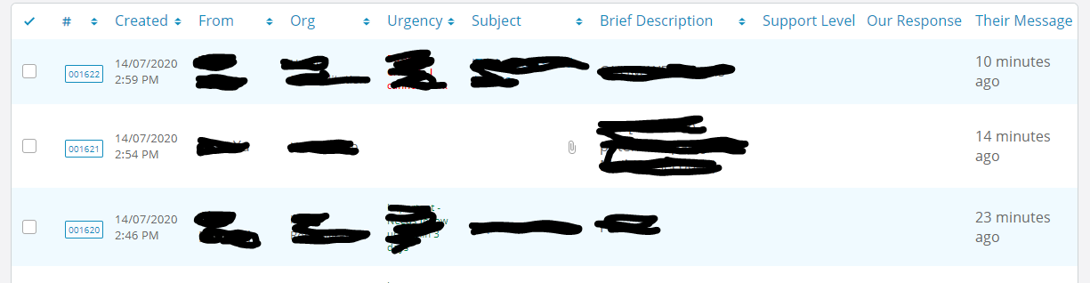
The above is current, and what we would like to get is below. The issue for us is some screens with bad colour, or lower brightness can barely tell between the white and light blue that it currently is.
Any help would greatly be appreciated
-
July 14, 2020 at 10:16 am #6074
stevland
KeymasterHi @NIcholasjansen,
Add the following to /osta/user-styles.css
table.list tbody tr td {
border-top: .1px solid #a6acaf !important;
}Note that you’ll want to back up and restore this file when upgrading osTicket Awesome in the future.
-
July 14, 2020 at 2:27 pm #6075NNIcholasjansenParticipant
Thanks @stevland that’s perfect 🙂 I wasn’t expecting to get exactly what I wanted haha.
-
July 17, 2020 at 8:34 am #6095Keymaster
I wasn’t expecting to get exactly what I wanted haha.
If only life was always like that!
The other option that occurred to me later is to darken the blue rows, or change the color to anything you prefer:
table.list tbody tr:nth-child(2n+1) td {
background-color: #dce7ec; /*change this value as desired*/
}
-
You must be logged in to reply to this topic.