-
-
July 27, 2020 at 7:50 pm #6149NNIcholasjansenParticipant
Hi there,
This request is probably a bit tricky if not impossible.
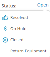
When changing the status of a ticket, we get this nice little drop down:

You can easily select an option to change it to.
Is there anyway to make other option fields behave like this? In our system we have a ‘Level of support’ and it would be nice to have a quick drop down like this because the field info is only ever, level 1, level 2, level 3
-
-
-
July 27, 2020 at 7:56 pm #6150
stevland
KeymasterHmmm I’m trying to at least understand your request.
Obviously Level of Support is some type of custom field you have set up, but I’m having trouble visualizing what exactly it is.
How do you currently switch between level 1 etc? Can you send a screen shot of how Level of Support appears on the page right now?
-
July 28, 2020 at 3:24 pm #6158NNIcholasjansenParticipant


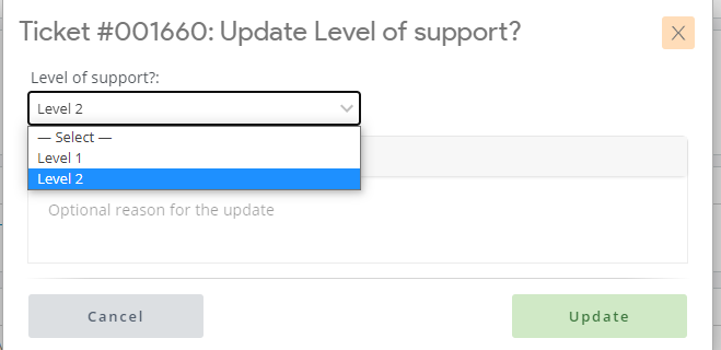
So Above is the current method – you click it (highlighted in red) and it opens another box. It’s not more clicks, and now that I think about it it’s not harder – just visually a lot happening for something so small
-
July 29, 2020 at 12:16 pm #6162
stevland
KeymasterThere is probably a way to do this, but it would only work on your system. In other words, this isn’t something I would consider doing to improve osTicket Awesome. It would be custom code created for you.
If you wanted my help implementing this for you, I could look more closely at what it would entail and figure out an estimate for labor. But it would be somewhere in the range of $100 US.
If it is something you would be interested in pursuing, let me know. But either way I will mark this as resolved.
-
August 2, 2020 at 6:08 pm #6169NNIcholasjansenParticipant
Hi @Stevland
Unfortunately I was a bit wrong and while the drop down does appear, when you select an option it still brings up that second box so it doesn’t make a big difference.
-
You must be logged in to reply to this topic.